DeFi Anime
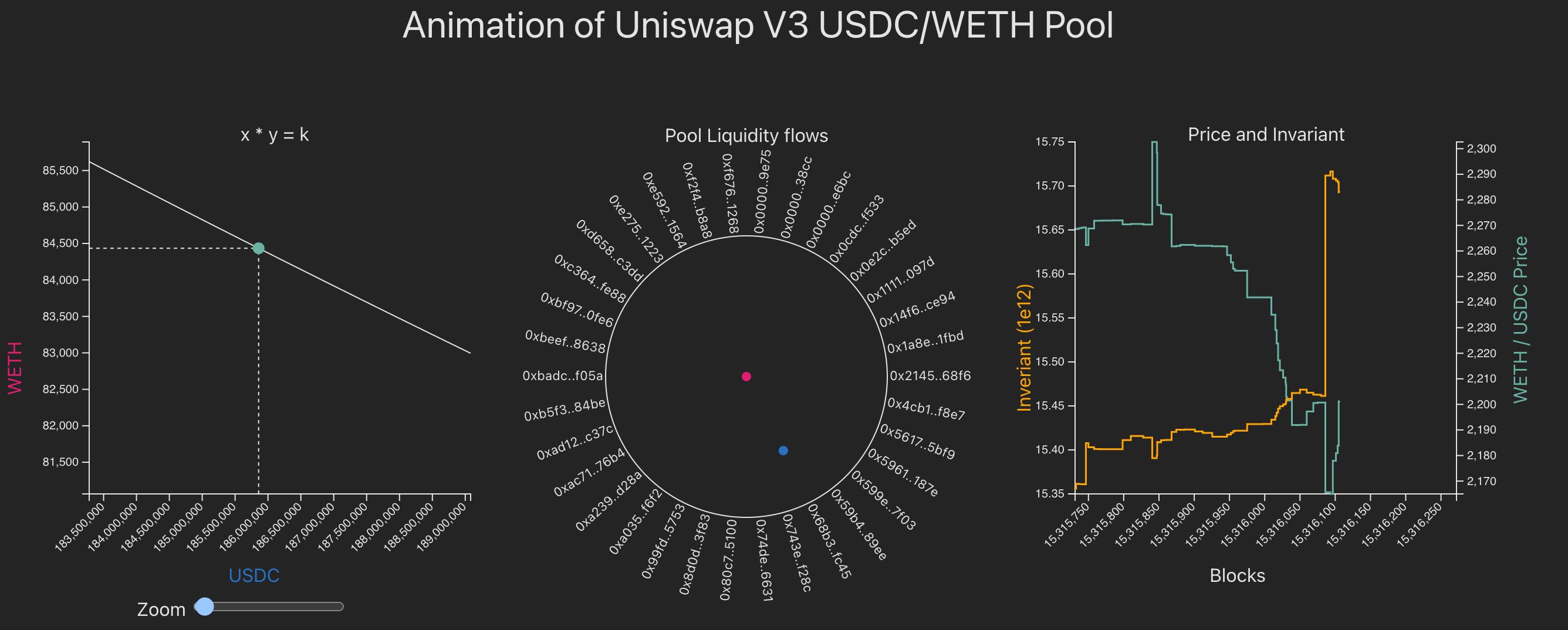
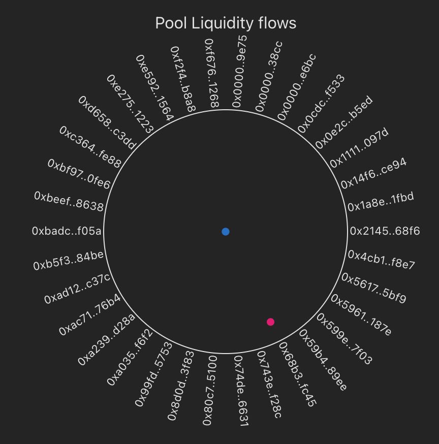
Animation of a Uniswap V3 USDC/WETH pool over different time periods
Project Description
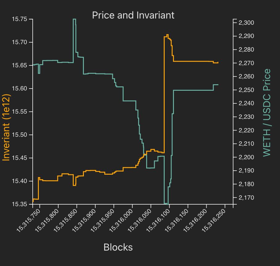
This project animates what happened to the Uniswap V3 USDC/ETH pool with 0.3% fee over different time periods. Most DeFI analytics are static snapshots of time, eg pool reserve balances, or charts of historical prices and volumes. Using animated visuals, details like which accounts liquidity flows can be made from when can be shown.
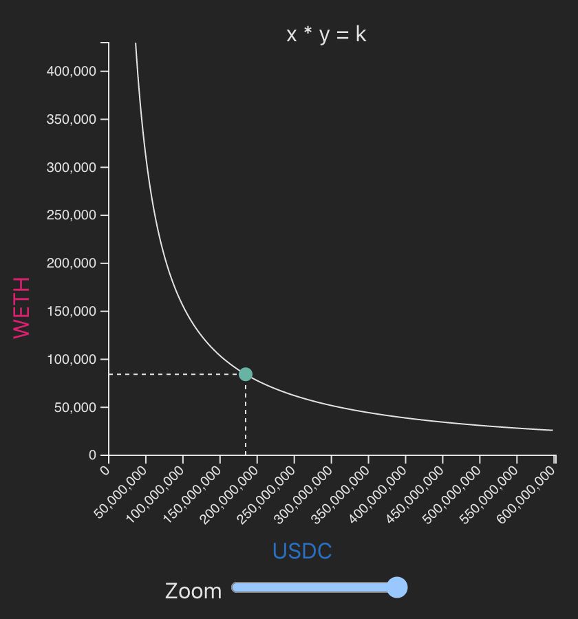
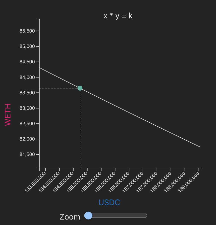
The workings of Uniswap's Automated Market Maker (AMM) can be clearly seen. The classic xy=k graph can be shown for each of the pool's positions. The transition between each of the pool's animations is animated.
This idea can be extended to other DeFi AMMs like Curve and Balancer. It could also be made to work with a live feed of a pool.
How it's Made
The dashboard uses Uniswap’s The Graph API to get the Uniswap V3 USDC/ETH pool data. Specifically, it uses two GraphQL queries to get
- The starting total value locked (TVL) of USDC and ETH in the pool.
- Any flow of liquidity in and out of the pool. That is any Mint, Burn or Swap transactions between a set time period.
The dashboard is made up of a number of visuals that use D3.js to animate what is happening over time. The D3.js library is a low-level tool that helps control the browser's DOM. Specifically, it uses Scalable Vector Graphics (SVG) objects like circles, lines, curves and text. These are built up to create animated visual components.
The website uses Vite as a package manager. The project was created using the vanilla TypeScript template. For the hackathon, the site was just run locally on the developer's machine.
Sponsored technologies
- Uniswap
- The Graph


