Connect the Fam
Redesigned WalletConnect UX for Seamless Onboarding: Creating a Cohesive User Experience for Self-Onboarding
Project Description
Redesigned WalletConnect UX for Seamless Onboarding
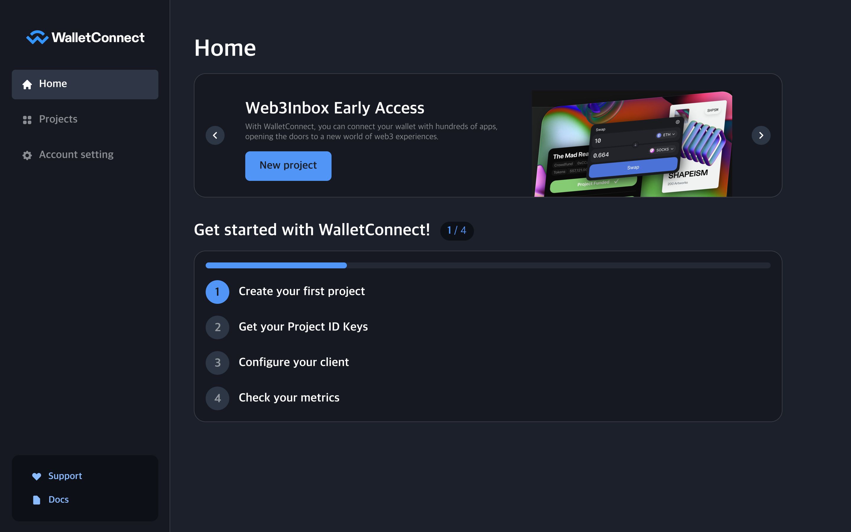
The objective of this project is to improve the current UX design for cloud.walletconnect.com and create a cohesive user onboarding experience that allows for self-onboarding without requiring assistance. The goal is to ensure that users can easily recognize and use WalletConnect products, understand the next steps after each action, be aware of their progress, and complete the onboarding process seamlessly.
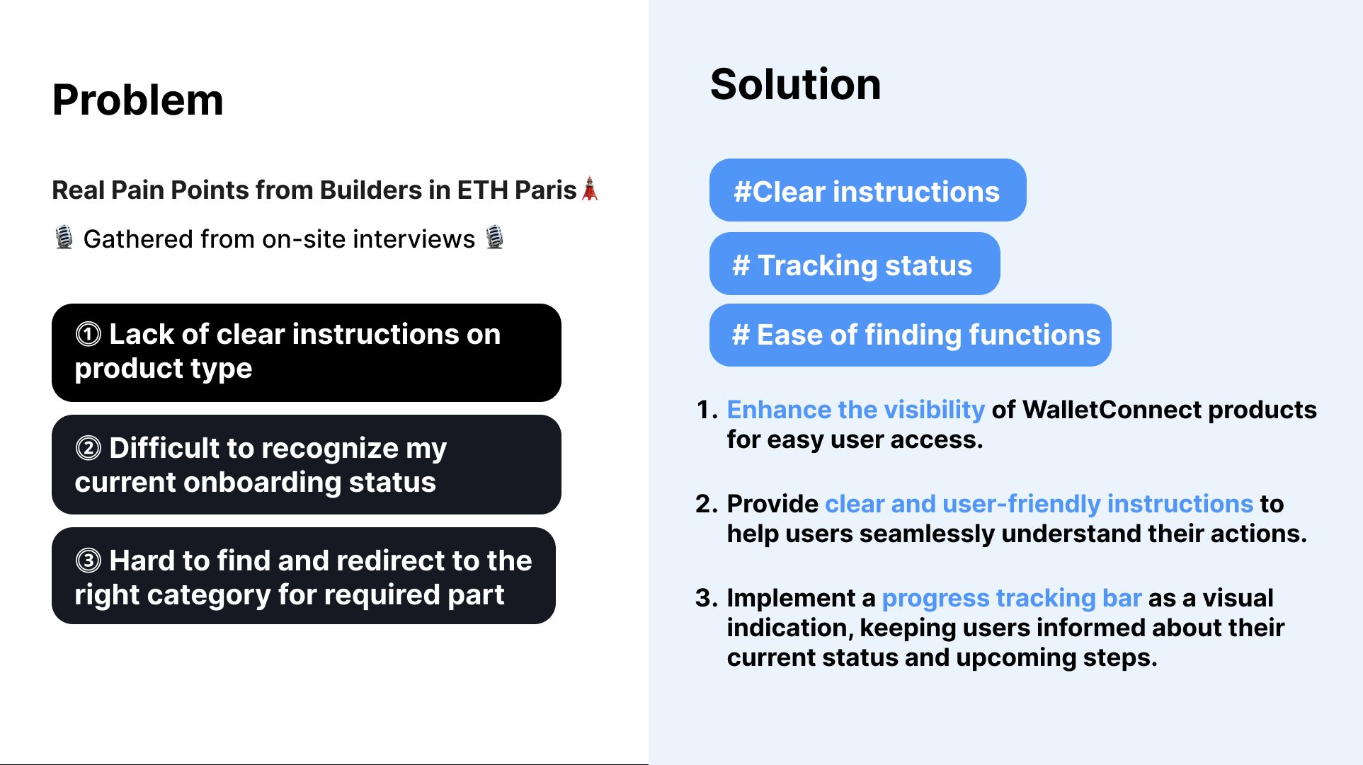
🤔 As-Is Painpoints:
- Lack of clear instructions on product type
- Difficult to recognize my current onboarding status
- Hard to find and redirect to the right category for required part
😊 To-Be Redesigned Goals and Actions:
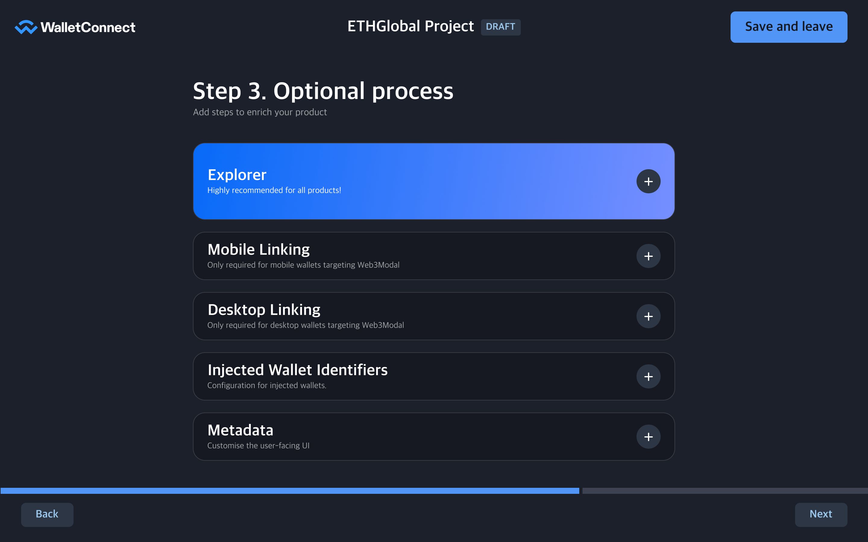
⓵ Enhance the visibility of WalletConnect products for easy user access.
- 🥅 Re-design Goal: To make users clear about what they are trying to build!
- ✍️ Actions:
- Clearly separate categories at the time of creating a new project.
- Define clear categories, populate them with relevant data, and provide concise category names.
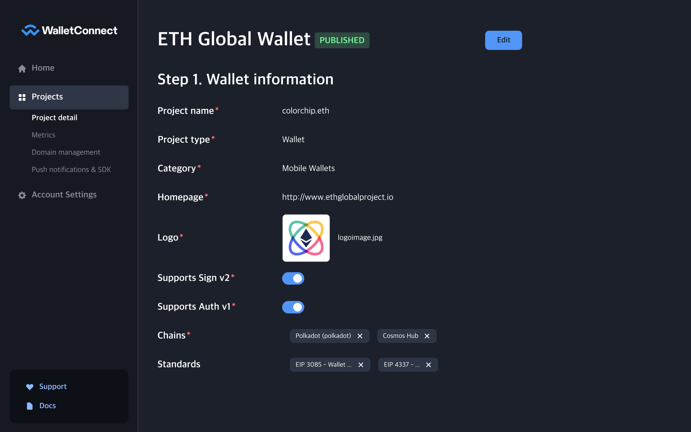
⓶ Provide clear and user-friendly instructions to help users seamlessly understand their actions.
- 🥅 Re-design Goal: Prevent users from getting confused!
- ✍️ Actions:
- Eliminate mixed instructions by restructuring and separating them.
- Emphasize and highlight the functions that the team aims to encourage users to utilize.
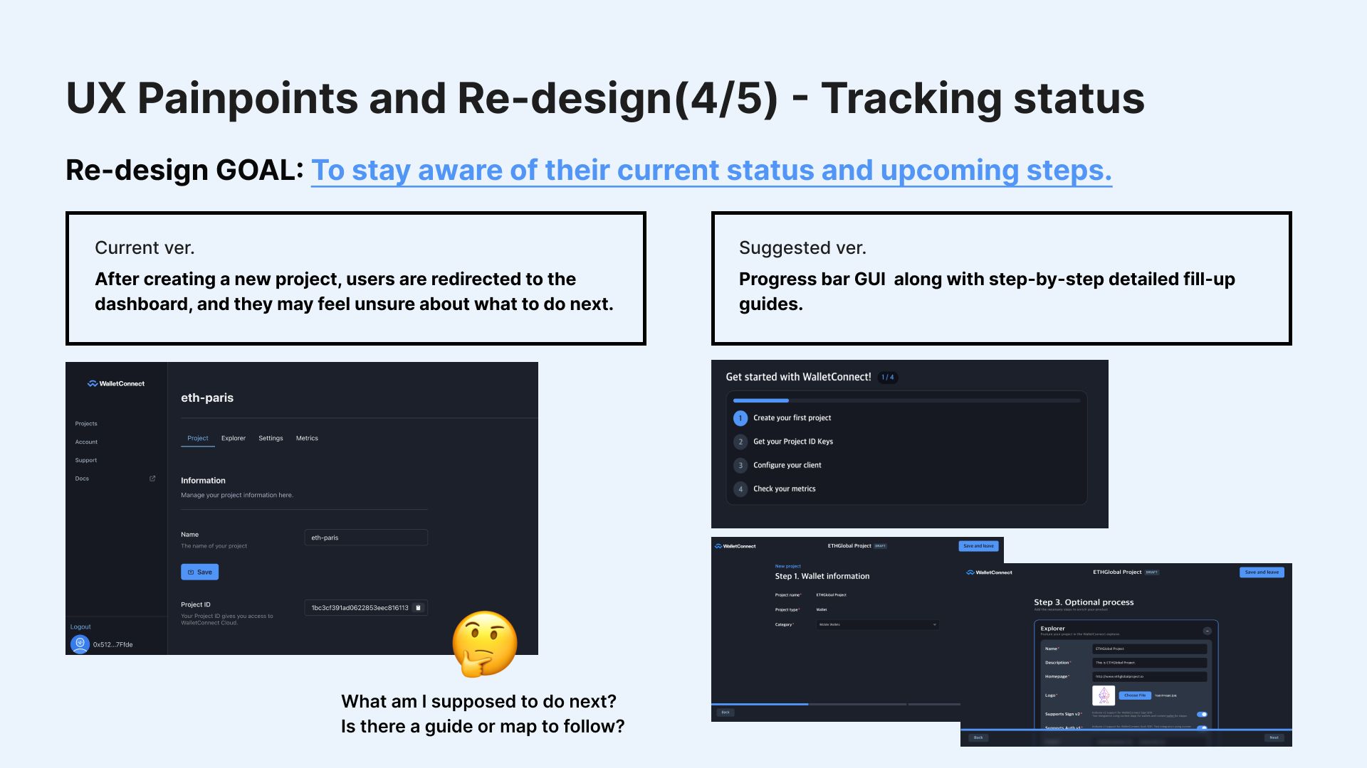
⓷ Implement a progress tracking bar as a visual indication, keeping users informed about their current status and upcoming steps.
- 🥅 Re-design Goal: Stay aware of their current status and upcoming steps.
- ✍️ Actions:
- Introduce a progress bar GUI along with step-by-step detailed fill-up guides.
By implementing these redesign goals and actions, we aim to create a user-friendly onboarding experience that empowers users to navigate and utilize WalletConnect products effortlessly.
Let's bring the WalletConnect family together! 👨👨👧👦
How it's Made
Firstly, we conducted real on-site interviews with builders in ETH Paris and directly engaged in user interviews to understand their experience when encountering cloud.walletconnect.com.
Based on their feedback, we identified three main pain points. To address these issues, we devised UX solutions that effectively tackle these pain points.
After analyzing the pain points and adopting the UX solutions, we proceeded to craft a new prototype for the entire onboarding process using Figma. The Figma prototype incorporates the refined user experience, ensuring a seamless and user-friendly onboarding journey for our users.
